Monday, 18 February 2013

Ridge Road Residence, Melbourne

The Ridge Road Residence by Studio Four is located on a gentle slope in a rural area and features a stunning charcoal timber exterior. Matching dark tinted windows enable the surrounding lanscape to be reflected "by using pared-back forms and detailing and a restrained palette of materials the emphasis becomes not on the insular and what has been 'designed in', but what nature has provided". The residence has an open plan living arrangement with the living room and dining room leading out to one of the terraces which is framed by a cubed timber structure with supporting columns. Full height windows stretch across the house revealing views of the topography and near by tea tree. These windows were installed to allow maximum sunlight to brighten the house. Concrete floors and thick walls were used to retain heat.

"We sought to create a quality of space that provides a sense of sanctuary, enclosure and comfort," say the architects. "Emphasis was placed upon capturing the varying qualities of light, the scale and proportions of space, and providing a tangible connection with the building's surrounds, both in topography and landscape."


Source: Dezeen
Share:

Sunday, 17 February 2013

Keyhole House, Linnéstaden

With white floorboards, white walls, natural tones and a charming decor, this apartment in Sweden looks relaxing and clean. The living room has two large windows that bring in natural light and with its high ceiling and bright colour scheme, there is an overall sense of space and comfort.

I love the plants dotted along on the windows, tables and kitchen worktop - it gives a very natural feel to the space. I also like how the white walls in the bedroom have been removed and replaced with a finely patterned wallpaper and in the IKEA-fitted kitchen we can see the exposed brick work which provides some texture and colour to an otherwise neutral home.

Traditional elements of the apartment remain including the wooden floors and cast iron radiator and the space is well decorated with stylish furnishings. I particularly like the small and subtle scientific elements in the decor such as the period table wall hangings in the living room and the use of chairs in the bedroom as bedside tables.

Share:

O4 House in Osijek

This house was designed by Helena Alfirevic Arbutina to enable its occupants to feel safe, secure and comfortable in an intimate setting as part of a community. Working with it's environment, the house has a defined spacial structure consisting of flat and sharp cubes on the side of the house with mild and rounded forms on the central part, accompanied by strong doors to add an element of privacy.

The house is sectioned into three wings to group and separate functional areas. The east wing has the garage (which accommodates a bedroom with an ensuite bathroom), a green patio and an intimate  wellness garden. On the other side is the wing that houses bedrooms for children and a shared bathroom. This wing is connected to communal areas such as the kitchen, pantry, living room and dining room. The living room, which is connected to both sides of the house by doubled glazed openings and doors, is in the shape of a rounded cube and has an immense height of interior space and a stunning sculptural fireplace. This makes up part of the central wing which is a public space and ideal for welcoming guests. Then along the northern terrace, an area for food preparation is located.

I really love the wooden details, white interior and pebbles that are located along passages and pathways to add an earthy feel indoors. The O4 House is a system of space and is intended to work with nature. It reflects tranquility, beauty and ensures sophisticated eco-friendliness. It's modernity and edginess showcase how humans can connect with the environment organically and fluidly.

Source: Home Adore


Share:

Black on White by Fabi Architekten

Designed by architecture studio, Fabi Architeken, this house is located in the crevices of a hill in Wenzenbach, Germany. The black top half of the building is shaped like a typical house with the angled/ triangular top and the bottom half of the house is white and shaped in a rectangular box style. The top half houses the kitchen, dining room and living room whilst the bottom half includes a bedroom and bathroom. Large windows and glass doors offer views over the natural landscape and hillside topography.

The main entrance is positioned on the side of the building and is sheltered by the overhanging first floor. The upper floor has glass doors that slide open and lead out to a triangular roof terrace whilst the level below provides a second entrance to the house - the levels are connect by a contemporary wooden staircase.

"A house like an archetype. As a prelude to the castle “Schönberg” (12th century) at the Wehrgraben – site of a former guard house. The house consists of two building volumes – one lying turned and cantilevered on a white flat roof box. A minimal intrusion into the hillside topography. The volumes open up targeted to the natural space, the forest." - From Fabi Architeken


Source: Architizer | Photography: Herbert Stolz
Share:

Saturday, 16 February 2013

H House by BANG by MIN

Designed for a family, the H House in South Korea by BANG by MIN was completed in 2012 and made to enable three generations of family to live together comfortably whilst maintaining each others privacy. 

"The architect created the second floor as an interspace of this house divided into three floors, where they can form a community of family, behave individually and have their own area. He divided the living room on the second floor into three levels, which give each member of family their own area naturally. This space opened but different in levels enables family to do privately and separately. And folding door and changeable wall make it possible to expand or divide the space according to the user’ demand."

It was then important to enable a good amount daylight and ventilation to flow throughout the house, particularly in the basement and first floor, to prevent the accumulation of dark and damp air. To solve this problem "the architect placed courtyard and sunken garden, connected from the lower floor to the sky, encouraging the brightness to the whole building."

The architect also needed to consider the fact that the client wanted to be able to rent the basement as a commercial space.

"Exposed concrete and wooden panels in mud color created the more effective result than the luxurious materials, with the constructing details the architect insisted on completing, although they are not expensive. The different materials to compose the building emphasize their property of matter and create the various looks with their shadow. The designer also used the materials by cutting them into small unit. These details make this house have a shape to reveal the virtue secretly with the sense of existence but without any overawing sense.”


Source: HomeDSGN
Share:

Sunday, 10 February 2013

Tepoztlán Lounge, Mexico

This gorgeous concrete getaway surrounded by trees and greenery in Mexico City is a lovely project by Cadaval & Solà-Morales. Built in 2012, the Tepoztlán Lounge is the first completed building as part of a larger project that includes a series of bungalows that can be rented in years, months or days. The lounge has been designed as a communal space for leisure and is located next to an immaculate lawn, a swimming pool and an abundance of nature which sets the boundaries for this space.

"The design establishes three separate living quarters designed in accordance to the 3 activities planned; each of them is a set space defined by its use, but also by a very clear and simple architectural container: the first holds an open bar with a kitchenette, together with a couple of restrooms and dressing rooms; the second is a play area for children that can also be used as a reading room when temperatures drop at night; and finally the largest container is the living area, an enclosed, tempered and comfortable space for conversation, TV, etcetera. But it is the desire to give continuity between these three separate areas where the project is empowered and becomes meaningful; a continuous space, in full contact with the nature but protected from its inclemency is set up not only to expand the enclosed uses, but also to allow new activities to arise."


Source: Architizer
Share:

Saturday, 9 February 2013

Aggrenad Hotel, Korea

Designed by AND Architects, the Aggrenad Hotel on Geoje Island, Korea, stands out structurally in an otherwise plain village landscape. The somewhat Brutalist style concrete architecture reveals a monolithic and organic quality that reflects the hotels concept accordingly.

The hotel was designed to encourage tourism in the area and to provide guests with different views of the same place. The unusual stacked shape means that rooms and balconies point out in different directions giving the property an unconventional edge. With just five suites spread over three storeys and a cafe, the hotel boasts varying views of the surrounding area whilst maintaining independence and privacy for its guests.

"The building is formed like how fingers are branched out from a hand forming different parts. It is the aggregation of unique rooms, yet at the same time, it is an organic monad. Each unit is cantilevered out towards the sea as if fingers are pointing at the nearby islands. This allows each unit to frame the surrounding landscape in a unique way. This three story building is consisted of five rooms and a small cafe, and the rooms stacked in five split levels. The floor and the ceiling of each unit are stretched out toward the different directions, and at the end of each unit is a small balcony, which opens up toward the sea and the sky."


Source: Dezeen
Share:

Friday, 8 February 2013

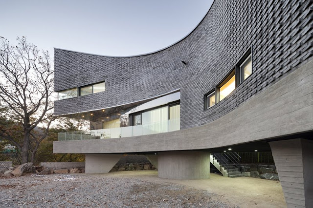
The Curving House, Korea

The 'Curving House' designed by JOHO Architects in Korea is a stunning structure. The form, curvature and varying textures of the building are enticing and unique for a residential project. The shape resembles a concave lens and was formed to accomodate the parking needs of the home owner, to emphasise the visual garden from the living room and to work with the topographical condition of the plot.

The ash-coloured exterior resembles the scales of a fish and works in a similar way - it has a water repellent coating of paint. The bricks are laid at angles to define the unique curve shape and provide different perspectives to those viewing the house from the distance.

"The rough texture of the traditional bricks interprets the lot in a different way in combination with the property of highly reflective stainless steel. The skies and nature reflected on the stainless steel surface distort what the true substance is to break the boundaries between shapes and texture. Unlike the rough texture of ceramic bricks, the stainless steel used on the front and on the side reflects the surrounding landscapes to make itself disappear. If the bricks reveal themselves by the change of light and shadow, the stainless steel de-materializes itself by making itself disappear in nature. Such contrasting textures have different properties and confront each other in a single mass, but they ultimately establish balance through the extinction and reflection of light."


Source: Architizer | Photography: Sun Namgoong
Share:
© Luxury Loves Design | All rights reserved.
Blog Template Designed by pipdig